Positioning
Tiles produced by show statements are positioned on the dashboard by means of a dedicated syntax that appears in the { ... } style block of that show. This syntax is intended to be auto-generated by the layout editor tool and is not expected to be manually edited, but it is still possible to do.
The grids
A tile is placed within a grid, which can be the global dashboard-level grid, or the grid of a smaller region of the dashboard created by show region. Placement consists in specifying 1. the range of columns occupied by the tile, 2. the range of rows, and 3. the grid on which it should be placed, using the syntax left..right, top..bottom in grid.
For example, to have a tile cover columns 1 to 12 and rows 4 to 6 in a region named general:
show label "Example" { 1..12, 4..6 in general }
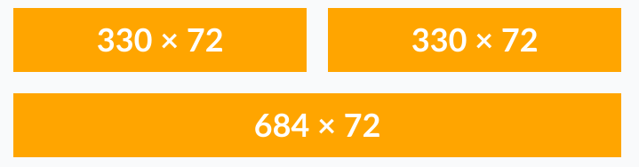
Another example with three show image tiles, and the corresponding dashboard as displayed:
// Three rows, three columns
show image "Top left" { 3..5, 1..3 in dash } with
  "https://placehold.co/330x72/orange/white.png"

// Three rows, three columns
show image "Top right" { 6..8, 1..3 in dash } with
  "https://placehold.co/330x72/orange/white.png"

// Three rows, six columns
show image "Bottom" { 3..8, 5..7 in dash } with
  "https://placehold.co/684x72/orange/white.png"
Note that the in dash is optional, and can be omitted: by default, a tile is placed on the dashboard grid.
Columns
All grids have 12 columns numbered from 1 to 12, which each take approximately one twelfth of the horizontal space available on that grid.
The dashboard grid always has a width of at least 1440 pixels, but will expand horizontally if more space is available. The horizontal gap between two columns remains fixed at 24 pixels.
If a tile’s placement would cause it to be too narrow (in pixels) to be displayed, then an error will be reported, at compilation time if possible, and otherwise when displayed. For example, having a one-column-wide tile in a one-column-wide region will almost always be too small. Note that this check is based on the 1440px minimum width of the dashboard, so an error will be reported even if the dashboard grid was expanded enough that the tile’s final width would be enough: the objective of this error reporting is to ensure that the dashboard is properly visible at all screen widths.
The column position is written as the first of the two ranges, or 1..12 in the example above. Both bounds are inclusive.
It is possible to omit the lower bound (1 is assumed), or the upper bound (12 is assumed), or to omit the range (the lower and upper bounds are both assumed to be equal to the number). For example:
| Short value | Actual value | Width (in columns) |
|---|---|---|
..6 |
1..6 |
6 |
7.. |
7..12 |
6 |
.. |
1..12 |
12 |
5 |
5..5 |
1 |
Rows
All grids have a round number of rows, each row being 24 pixels high, with no gaps between rows. The offsets between grids are also multiples of 24 pixels, so that rows on different grids are all aligned with one another (even if at different row numbers).
The rows are numbered from 1 to the maximum. For the dashboard grid, the maximum row is 5000. For smaller grids, the maximum row tends to be determined by the height of that grid’s container. In any case, exceeding the maximum row of a grid will be reported as an error.
Due to the lack of vertical gaps in the grid, an error will be reported if two tiles are placed vertically adjacent to one another. For instance, it is forbidden to place two tiles on rows 1..2 and rows 3..4 respectively, and instead it is necessary to leave row 3 empty by placing the second tile on rows 4..5.
As for columns, it is possible to omit the lower bound (1 is assumed), or to omit the range, but the upper bound cannot be omitted. For example:
| Short value | Actual value | Height (in pixels) |
|---|---|---|
..3 |
1..3 |
72 |
5 |
5..5 |
24 |
Regions
The primary way to create additional grids (beyond the dashboard’s global grid) is to use show region. The recommended best practice is to give a name to the region by assigning it to an identifier. This identifier can then be used with the in name positioning syntax from other show statements.
For example, the example below creates an (empty) region named general occupying 2 columns and 7 rows, then places two scalar tiles occupying 2 rows each, one above the other.
general = show region { ..2, ..7 } // implicit 'in dash'

show scalar "2024" { ..,  ..2 in general } with 13370
show scalar "2025" { .., 4..5 in general } with 42000
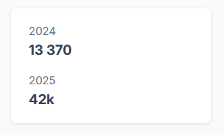
In this example, the region is displayed as a card (white background, rounded corners, slight shadow), which automatically introduces a 24 pixel padding around its contents. Because of this padding, two of the seven rows are unavailable for placing contents, and so the inner grid is only five rows high.
Note that it is forbidden from placing a region inside another region.
It is recommended to place the show region statements before the show statements that reference it by name. However, to help make the layout editor easier to use, Envision tolerates having the show region appear after. The following example is equivalent to the above:
show scalar "2024" { ..,  ..2 in general } with 13370
show scalar "2025" { .., 4..5 in general } with 42000

general = show region { ..2, ..7 }
As is the rule for tile identifiers in general, region identifiers must be unique for the entire script, and may not be re-assigned.
Headers and footers
A region may contain two special elements: a two-row header (followed by an empty row) and a two-row footer (preceded by an empty row). These are introduced by show header and show footer, and do not support the positioning syntax. Instead, they must be associated with a region by using the show region .. with nested show syntax.
This example creates a region with a header “Yearly Revenue” and two scalars for 2024 and 2025.
general = show region { ..2, ..9 } with
  show header "Yearly Revenue"

show scalar "2024" { ..,  ..2 in general } with 13370
show scalar "2025" { .., 4..5 in general } with 42000
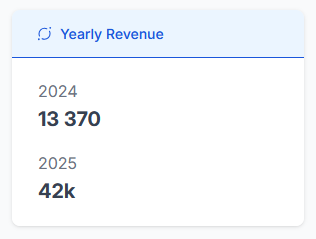
The header (and footer) are not positioned on the region’s inner grid, and are instead treated as part of the padding. In other words, in the above example, the first scalar is positioned on rows 1 and 2, but would have been rows 4 and 5 if the header had been placed on that grid.
Note that only show header and show footer are allowed inside a show region .. with block. Other tile types are not allowed.
Card and non-card displays
The card display can be disabled for a region using the nocard modified:
general = show region { ..2, ..5 nocard }

show scalar "2024" { ..,  ..2 in general } with 13370
show scalar "2025" { .., 4..5 in general } with 42000
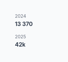
The nocard removes the padding around the contents of the region (and thanks to that, the region can now be two rows smaller than its card equivalent).
A show header or show footer may not be placed inside a nocard region.
The main purpose of a nocard region is to subdivide dashboard columns differently, for example subdividing the width of four dashboard columns into six columns of equal width. It may also serve to group together tiles so that they can be moved together in the tile editor, or exported together fromthe script.
Special regions
In addition to dash, every script comes with two additional pre-defined regions: top and bottom. These regions are sticky (they remain in place when scrolling) and have a limit of 10 rows, but will shrink to fit their contents exactly. For example:
show image "Bottom" { 3..8, ..3 in bottom } with
  "https://placehold.co/684x72/orange/white.png"
This will show a 3-row (72 pixels) sticky footer at the bottom of the page, containing the image tile.
If no tile is placed inside the bottom region, it is not displayed at all.
If no tile is placed inside the top region, it displays a title tile and either a submit tile or a slices tile, depending on whether the dashboard is sliced or not.