Designing dashboards
Envision dashboards are built from smaller units called tiles. These tiles can be adjusted in size and color, and they can be arranged in any way you see fit within the dashboard page. Envision emphasizes high-productivity dashboards, where all the figures that matter to your commerce are arranged into a single page. Even very complex dashboards are typically displayed in less than half a second. In this section, we explain how to design Envision dashboards from scratch.
Your first dashboard
We will design our first dashboard using the sample dataset. The screenshot below illustrates the dashboard that you should obtain in your Lokad account.
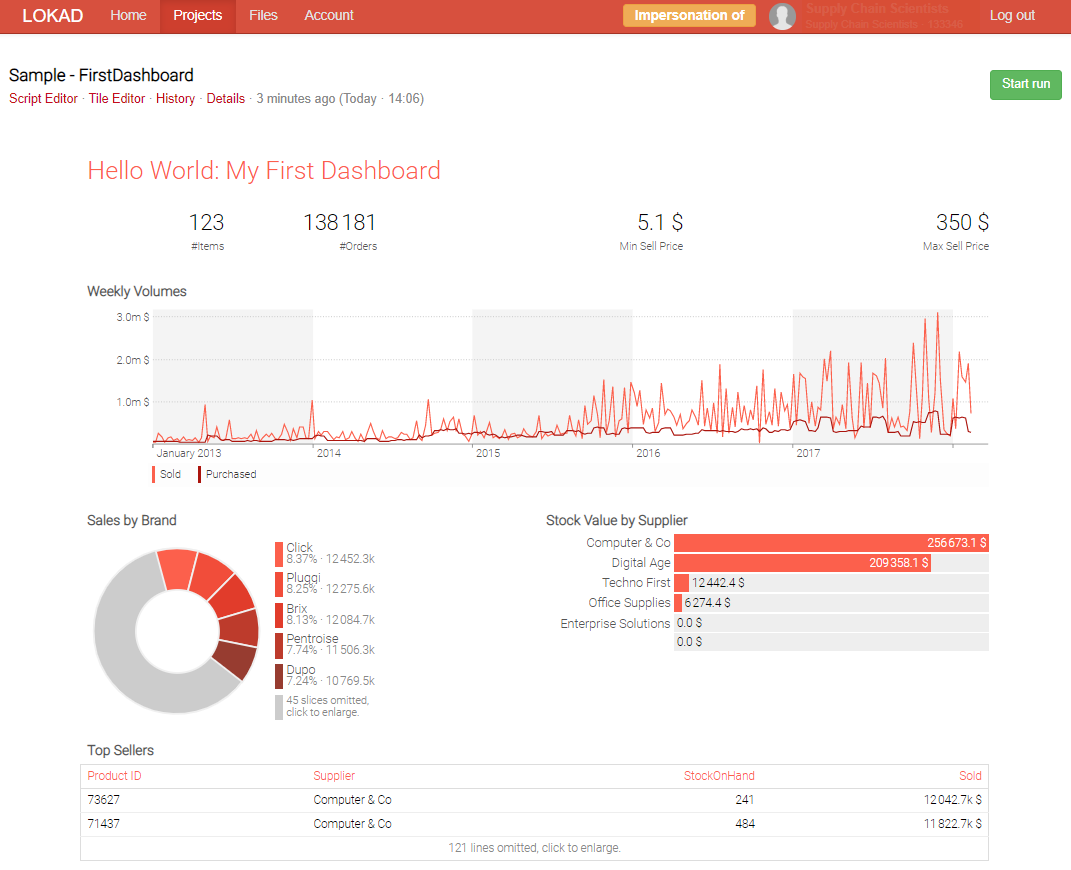
This dashboard is generated with the script detailed below. At this point, the script probably feels a little bit overwhelming. We are going to decompose this script line by line in the following section.
read "/sample/Lokad_Items.tsv" as Items[id] with
  Id : text
  Brand : text
  Supplier : text
  BuyPrice : number
  SellPrice : number
  StockOnHand : number

read "/sample/Lokad_Orders.tsv" as Orders expect [Id, Date] with
  Id : text
  Date : date
  NetAmount : number

read "/sample/Lokad_PurchaseOrders.tsv" as PO expect [Id, Date] with
  Id : text
  Date : date
  NetAmount : number

show label "Hello World: My First Dashboard" a1f1 { tileColor: tomato }

show scalar "Items" a2 with count(Items.*)
show scalar "Orders" b2 with count(Orders.*)

show scalar "Min Sell Price" c2d2 with min(Items.SellPrice)
show scalar "Max Sell Price" e2f2 with max(Items.SellPrice)

Week.oamount = sum(Orders.NetAmount)
Week.pamount = sum(PO.NetAmount)
show linechart "Weekly Volumes" a3f5 { tileColor: tomato } with
  Week.oamount as "Sold"
  Week.pamount as "Purchased"

show piechart "Sales by Brand" a6c8 { tileColor: tomato } with
  sum(Orders.NetAmount)
  group by Items.Brand

show barchart "Stock Value by Supplier" d6f8 { tileColor: tomato } with
  sum(Items.StockOnHand * Items.BuyPrice)
  group by Items.Supplier

show table "Top Sellers" a9f12 { tileColor: tomato } with
  Id as "Product ID"
  Items.Supplier
  Items.StockOnHand
  sum(Orders.NetAmount) as "Sold"
  group into Items
  order by sum(Orders.NetAmount) desc
At this point, we suggest to actually log into your Lokad account, click Create Envision Script, copy the script above, and then click Start Run. Once the run completes, click the newly displayed green link among the Recent runs just below the Start Run button. You should have in front of you a dashboard identical to the one above.
The dashboard fits into a single page, but every tile can be expanded if clicked on. Click on the large line chart, and the line chart expands to take advantage of your entire browser window. If you click again anywhere in the black area around the expanded tile, the tile shrinks back to its original size.
Title, position and color
The label tile is the simplest tile available in Envision. This tile is a good starting point to understand the common properties shared by all tiles, that is, their title, position and primary color. The label tile merely displays a piece of text specified in the tile, and the font size is adjusted to fit the tile.
show label "Hello World" a1f1 { tileColor: tomato }
All tiles are displayed by using a show statement. This keyword is followed by 4 arguments. The first argument is the tile type. Envision supports many types of tiles, and label is one of these types. In the following section, we review a couple of other types of tiles that are also present in this dashboard.
After the tile type comes the title of the tile defined with a text value, hence the quote (") delimiters. Depending on the type of tiles, the display of the title may vary, but the title is frequently displayed at the top of the tile. Then, after the title, comes the position of the tile, written as a1f1 in the example above. Envision adopts an Excel-like grid to position all the tiles, with letters used for the columns and numbers used for the lines. Hence, a1f1 should be interpreted as the cells ranging from the upper left corner a1 to the lower right corner f1.
Finally comes the tile color, tomato in the example above. The Style color argument is optional, and when omitted, the color black is used by default. All the named web colors are valid for Envision. Beyond named colors, Envision also accepts any hex triplet with the minor twist that the hash sign (#) should be omitted. For example, 0099CC should be used instead of #0099CC. However, in practice, colors are too tedious to be edited directly from the script editor.
The tile editor
While editing the tiles’ positioning and colors from the script editor is possible, it is not overly practical since the script editor is not visual. As a result, Envision includes a second editor named the tile editor. The tile editor offers the possibility to adjust the titles, positions and colors of every tile, plus a few extra features to speed-up a complete rearrangement of a dashboard when needed.
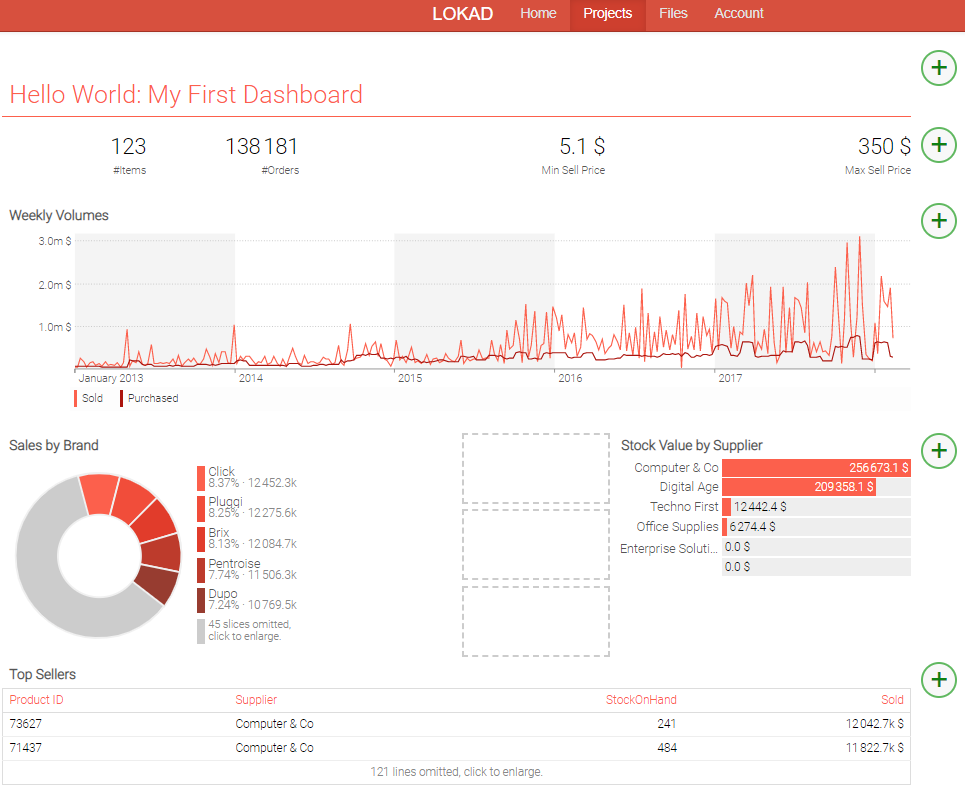
In your Lokad account, go back to the dashboard that has been generated previously, and click on Edit Tiles. To move a tile, the top label tile for example, click on the tile and then click and drag over an empty space (the squares framed by a dashed line or the white space at the bottom of the dashboard).
You will also notice green-colored plus (+) buttons on the left side of the page. The purpose of these buttons is to insert a blank grid line just above the button. Click on any of the (+) buttons, and you should see that all tiles are shifted downward. Inserting a blank line is practical when one wants to push a section of the dashboard towards the top (and conversely another section towards the bottom).
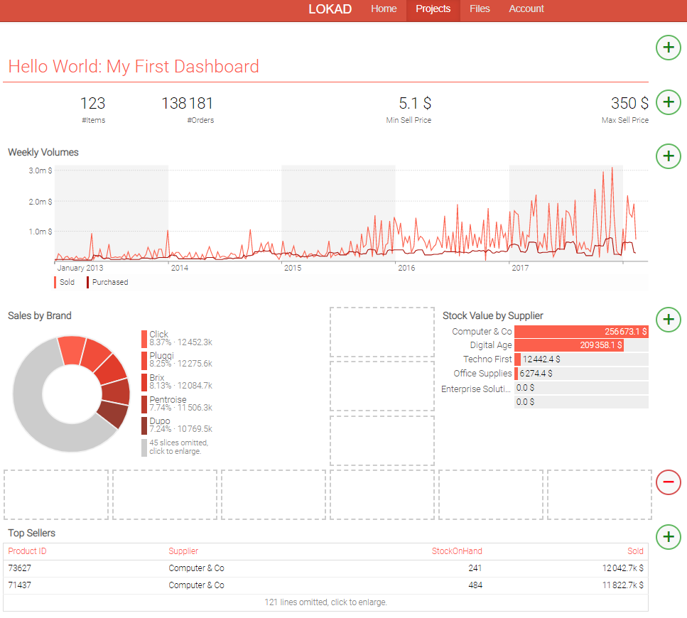
Once you click the (+) button, on the right, a red-colored minus (-) button appears. These red buttons are the counterparts of the green buttons, and they offer the possibility to delete a blank line. The line has to be blank however for the red button to appear, as this protects you against deleting a line that still contains tiles. As a rule of thumb, when coding a script, we suggest not to pay too much attention to the positioning and colors of the tiles. If tiles end up overlapping, Envision automatically rearranges such tiles to make sure that they all remain visible. Thus, there is no risk of incorrectly positioning the tiles. The tile editor is there to give the final visual touch to your dashboard.
Displaying single-value indicators
While displaying a million numbers is easy, displaying 10 numbers worth being read every day is very difficult, as we’ve mentioned previously. One of the most frequent cases when building a dashboard consists of designing a tile that contains only a single value. This behavior is achieved with the table tile. This tile benefits from a special display when the table merely contains a single cell, that is, a 1x1 table. The following script displays 4 distinct indicators, as outlined below with the relevant lines.
show scalar "Items" a2 with count(Items.*)
show scalar "Orders" b2 with count(Orders.*)

show scalar "Min Sell Price" c2d2 with min(Items.SellPrice)
show scalar "Max Sell Price" e2f2 with max(Items.SellPrice)
The show table statement starts with the type, title, position and color options; the pattern is identical to the one used for the label tile. These options are followed by the with keywords. For all tiles that contain data, the with keyword indicates that the variables to be included in the tile are to be enumerated. Here, our tiles only contain a single value each, but in the following sections we will see more complex tiles that embed several values.
At this point, we have not yet covered the aggregation capabilities of Envision. Without getting into too much detail, let’s note that sum, min and max are aggregators, and that they operate pretty much according to what could be expected from their Excel counterparts.
The sum(Items.*) and sum(Orders.*) give the total number of lines in the Items and Orders tables, respectively.
Displaying a line chart
The line chart is also one of the most frequently used tile types in Envision. In this case, as data needs to be aggregated with a periodicity – per day, per week, per month – using the linechart is slightly more complex than the tiles we have seen so far. Let’s review the piece of script that is used to display a line chart.
Week.oamount = sum(Orders.NetAmount)
Week.pamount = sum(PO.NetAmount)
show linechart "Weekly Volumes" a3f5 { tileColor: tomato } with
  Week.oamount as "Sold"
  Week.pamount as "Purchased"
The Week table is not a usual table in the sense that it is not a table loaded from the data. As periodic aggregations are frequently encountered in commerce, in Envision, such periodic aggregations are treated as first-class citizens. As a result, operations that involve periodic aggregations are much simpler to implement. However, this specific aspect of the Envision language goes beyond the scope of this document. Let’s just say that Week acts as a recipient where the data is grouped into weekly buckets.
Then, through the assignment operator, we compute one value per week for Week.oamount and another value per week for Week.pamount.
The line chart statement that starts with show linechart is a bit longer than, say, a simple label tile. In order to avoid a long and somewhat unreadable statement, we use the block syntax. The block should start after the with, and then all tile arguments can be listed below, one argument per line.
The title of the line chart also includes a declaration of a monetary unit with the unit: "$" option, as we have already seen with the indicator display.
Following that, after the line return, we have two vectors listed, namely Week.oamount and Week.pamount. As previously mentioned, after the with, it is possible to list one or several variables separated by comma. Those variables are displayed by the tile. In the present case, two variables are passed to the tile. A linechart can support more than two variables, however in practice, we recommend not to include more than three variables, because such charts tend to become quite unreadable when more than three lines are present in the script.
The variables passed as an argument to the tile can also be explicitly renamed. This behavior is achieved with the as keyword, followed by the text value defining the new name. Every tile type tends to have its own way of dealing with variable names as to improve the look and feel of the tile. For example, the line chart turns these names into a legend displayed below the actual chart. However, the variable naming mechanism using the as keyword is shared across all the tiles and is not restricted to the linechart. The text value associated to the as can also contain a measurement unit, with a behavior identical to the one of the title.
By default, the linechart picks a series of colors based on the color specified for the tile itself. However, it is also possible to specify one color for each line to be plotted. This can be done with the syntax:
Week.oamount = sum(Orders.NetAmount)
Week.pamount = sum(PO.NetAmount)
show linechart "Weekly Volumes" a3f5 { tileColor: tomato } with
  Week.oamount as "Sold" { color: "blue" }
  Week.pamount as "Purchased" { color: "red" }
Displaying a table
Let’s skip the piechart for now to directly cover a more advanced usage of the table. Tables, while not being overly visual, are probably one of the most versatile ingredients of action-oriented dashboards. Tables are frequently used to display prioritized action lists such as the most overstocked or the most understocked products. In the script above, we have a semi-complex table defined at the end of the script (copied below for the sake of clarity).
show table "Top Sellers" a9f12 { tileColor: tomato } with
  Id as "Product ID"
  Items.Supplier
  Items.StockOnHand
  sum(Orders.NetAmount) as "Sold"
  group into Items
  order by sum(Orders.NetAmount) desc
This statement could be written in a single line, however, to make it more readable, we use, once again, the tile block syntax. The syntax follows the general Envision norms that we have seen so far with 4 variables being listed after the with keyword. The declaration ends with a special order by statement that we will review below.
In addition, Envision does not merely allow variables to be listed, but expressions as well. We are taking advantage of this capability above. The sum() computes an aggregate at the item level, and this calculation is expressed directly within the tile. It would have been possible to declare the vector beforehand with:
Items.Sold = sum(Orders.NetAmount)
show table "Top Sellers" a9f12 { tileColor: tomato } with
  Id as "Product ID"
  Items.Supplier
  Items.StockOnHand
  Items.Sold
  group into Items
  order by sum(Orders.NetAmount) desc
The possibility of declaring expressions within a tile statement makes the script more compact and typically easier to read and to maintain.
Finally, the last line starts with order by and, as the name suggests, this line controls the order of the lines to be displayed in the table. The desc flag indicates that a descending order should be used. Alternatively, when the desc flag is omitted, the ascending order is used.
Please note that each dashboard is allowed to have a slice set. We describe the details in the slices reference.