Beautifying dashboards
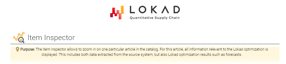
While the other sections in the Envision user guide focus on the core technical functionality of Envision, this section highlights possibilities to make dashboards visually appealing and easy to use. In the following sample dashboard an item inspector is presented, that allows user to get all relevant information for one article in the product catalog.
Table of contents
Slicing for real time interaction
In order to provide access the fine-grained information such as KPIs at the product level, the “slicing” feature of Envision can be leveraged. This feature offers the possibility to pre-compute one dashboard per “slice”, for example, each slice being associated with an item as illustrated in the code below. Unlike Envision forms, slices offer the possibility of real-time interaction with an Envision dashboard.
In Envision, this can be done using the following code.
Items.Q365 = sum(Orders.Quantity) if (Orders.Date >= max(Orders.Date) - 365)
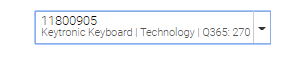
table Slices[slice] = slice by Id title: Id \
subtitle: "\{Items.Name} | \{Items.Category} | Q365: \{Items.Q365}"
In the upper right corner of the dashboard, a dropdown list is displayed. The user can select an article and the dashboard is instantaneously refreshed.
Headers with StyleCode
As first element in the dashboard, a title label and a markdown as explanation of the purpose of the dashboard are placed.
The logo is centrally placed using the show logo tile, that is:
show logo "" c1d1 fcaf20
Icons and labels
A label including one of Lokad’s icons is used as title.
// StyleCode: Icon in #FDAD31 (orange), but text in a more neutral #2e3133/dark grey
show label "Item Inspector" a2f2 FDAD31 {labelIcon: "analytics-magnifier"
                                         textColor: #2E3133}
Here, the overall color of the tile is set to #FDAD31, but later modified
the text color to #2E3133, so that the icon becomes orange while the text stays in dark grey.
Styling markdowns
A markdown quickly recalls the purpose of this dashboard. In general, markdowns can be used to format texts including elements such as links, lists and horizontal lines.
// StyleCode: highlight tile with bg. color #FFF7DD and center the text
show markdown "" a3f3 {backgroundColor: #FFF7DD; textAlign: center} with """
  __💡 Purpose: __ The item inspector allows to zoom in on one particular article
  in the catalog. For this article, all information relevant to the Lokad
  optimization is displayed. This includes both data extracted from the
  source system, but also Lokad optimization results such as forecasts.
  """
To make the text in the markdown stand out, the background color is set to #FFF7DD. Note that, in this example, the tileColor would only specify the color of the title that is empty here.
For lightbulb icon 💡, Envision’s possibility to display Unicode symbols (see e.g. here for a list) is used which can be integrated by copy and pasting them into the code.
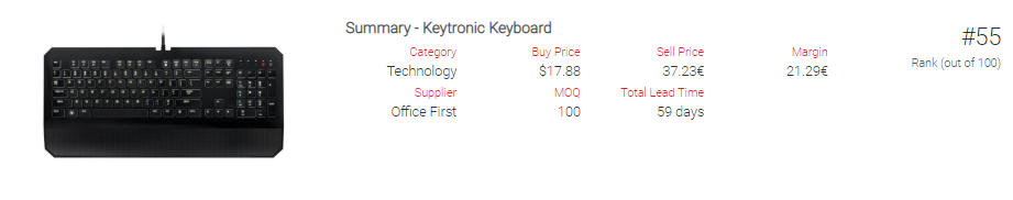
Key article information
Key information on a product such as pictures for easy identification as well as pricing and category information are best displayed at the top.
Sliced image display
Displaying an image of the item helps users to identify the article and give some overall context. For showing the article’s photo a sliced label is used.
show label same("\{Items.ImagePath}") by Slice a4b5
Styled sliced summaries
A summary tile is used to state some information on the article.
// We buy in USD and sell in EUR
Items.BuyPriceEUR = forex(Items.BuyPrice,"USD","EUR",today()-2)
show summary same("Summary - \{Items.Name}") by Slice c4e5 ea162a slices: Items.Slice with
same(Items.Category) as "Category"
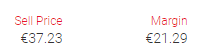
same(Items.BuyPrice) as "Buy Price" {unit: "$"}
same(Items.SellPrice) as "Sell Price" {unit: "€"}
same(Items.SellPrice - BuyPriceEUR) as "Margin" {unit: "€"}
same(Items.Supplier) as "Supplier"
same(Items.RefMOQ) as "MOQ"
same(Items.LeadTime) as "Total Lead Time" {unit: " days"; precision: 0}
Here, amounts are displaced in different currencies. In the example, purchasing is done USD and selling in EUR. Usually, the $ sign is displayed on the left, whereas the € sign is on the right. StyleCode automatically takes care of this for major currencies, it can, however, also be changed using e.g. for € the following code {unit: "€"; unitPosition: left} so that the €-symbol is shown on the left side of the value.
Another group of numerical values that is quite common are lead times. In this example, Items.LeadTime is the average observed lead time as a floating point number. However, for the purpose of a summary, only the integer part using precision: 0 is shown. This is equivalent to using same(round(Items.LeadTime)).
Flagging via dynamic coloring
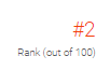
To give context on the article’s performance a rank of the article with respect to it’s last year’s overall sales volume is included: For this the function rank() is called to rank each article according to its total sales volume of the last 365 days of data. Here, the highest volume article has rank 1.
To give an immediate visual clue, the text color is dynamically formatted: If the item is among the catalog’s top 30% performers, the rank is colored red, otherwise it is left at dark grey.
/// Show the item's performance
Items.V365 = sum(Orders.NetAmount) if (Orders.Date >= max(Orders.Date) - 365)
where Items.V365 > 0
  Items.Itemrank = rank() sort Items.V365
  max = max(Items.Itemrank)
  Items.IsTop = Items.Itemrank / max < 0.3
  Items.Color = if Items.IsTop then "#f44009" else "#302e2c" // if Item top => orange, if not grey

  {unit:"#"; unitPosition:"left"}
  show scalar "Rank (out of \{max})" f4 slices:Slice color:same(Items.Color) by Items.Slice with
    Items.Itemrank
Since the dashboard is sliced by id, the color can be defined using color:same(Color) by Slice. Here, the definition of the color is not part of the StyleCode elements that are static, but part of the tile definition that allows for dynamic values. If an article is selected that is among the top sellers, then it’s rank is displayed in red, such as displayed below.
Stock levels display with line charts
Next the evolution of stock levels is displayed for the article.
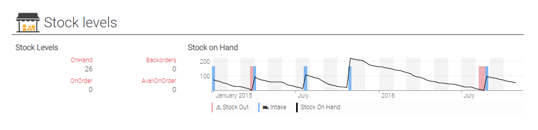
This section is started with a label and a summary tile as above.
show label "Stock levels" a7f7 FDAD31 {labelIcon: "store-and-boxes"
                                       textColor: #2e3133}

show summary "Stock Levels" a8b9 ea162a slices: Items.Slice with
  same(Items.StockOnHand) as "OnHand"
  same(Items.BackOrder) as "Backorders"
  same(Items.StockOnOrder) as "OnOrder"
  same(max(0, Items.StockOnOrder - Items.BackOrder)) as "AvailOnOrder"
While the current stock data is key to understand, how much one should purchase for this article, historic stock data can help put past sales in a context: If the history shows that there has been a period where this article was out of stock, then seeing no demand during this time simply means that potential customers were prevented to buy. Limited demand during that time therefore needs to be excluded for predictions of future demand.
Therefore, it is useful to highlight past stock out events as well:
Week.monday = monday(min(date) into week)
Week.Items.Slice = Items.Slice
Items.MaxLevel = max(Week.Items.StockOnHand)

where date > date(2015,1,1)
  show linechart "Stock on Hand" c8f9 slices: Week.Items.Slice with
    same(if Week.Items.IsStockOut then Items.MaxLevel * 0.75 else 0) as "⚠ Stock Out" {seriesType: stack
                                                               color: #edadb2}
    same(if Week.Items.Intake then Items.MaxLevel * 0.75 else 0) as "⛟ Intake" {seriesType: stack
                                                        color: #81b8ef}
    sum(Week.StockOnHand) as "Stock On Hand" {seriesType: line}
    group by Week.monday
In the example, the evolution of the stock on hand is plotted by week as a regular time series line. In fact, {seriesType:"line"} could also be omitted since it is the default setting in line 9. In the lines before, we the stock out and intake events are displayed by using the series type stack together with coloring. In order to get consistent shapes, the height of the boxes for the line chart is set at 75% of the maximum stock levels.
Sales reporting
The main input of Lokad’s forecasts consist of the sales history of a product. In this item inspector example, the sales reporting takes the following shape.

Highlighting rows in tables via icons
To quickly analyze a product’s recent sales history, the last orders are listed in the table. As a visual clue, those orders are highlighted that have a particularly high volume by a ✮ flag in the table. As a further highlight, the cell background of this column is set to #F9EFD9.
Orders.IsPriority = Orders.NetAmount > 100
Orders.Icon = if Orders.IsPriority then "✮" else ""
show table  "Orders" a10b13 000000 slices: Items.Slice {tileColor: #FDAD31} with
  Orders.Icon as "Priority" {textAlign: right; cellBackground: #F9EFD9}
  Orders.Date as "Date"
  Orders.Quantity as "Quantity"
  Orders.NetAmount as "Net Amount" {unit:"€"}
  Orders.Client as "Client"
  order by Orders.Date desc
Styled time series for sales histories
Plotting a product’s sales history is usually a good start to understand sales pattern. As they can be quite erratic, a ‘smoothed’ average can be quite helpful as depicted here in orange. For this seriesType, seriesType:"line" there are three options of how to draw the line, namely solid (default), dotted and dashed. This example uses the latter to draw the average weekly sales quantity.
Secondly, the sales quantity over a lead time is of importance as reference for the forecast.
show label "Sales" a9f9 FDAD31  {labelIcon: "circular-diagram-analytics"
                                textColor: #2e3133}

moend = monday(max(Orders.Date))
mostar = monday(min(Orders.Date))

Day.Items.Slice = Items.Slice
Week.Items.Qty = 0

where (date >= mostar and date <= moend)
  Week.Items.Qty = sum(Orders.Quantity)
Week.Items.QtyAvg = 0
where date >= mostar + 4*7 and date <= moend - 4*7
  Week.Items.QtyAvg = avg(Week.Items.Qty) over [-4..4]

where date > date(2015,1,1)
  // Weekly sales
  show linechart "Weekly Quantity Sold" c10f11 slices: Week.Items.Slice  with
    max(Week.Items.Qty) as "Weekly Quantity Sold"
    max(Week.Items.QtyAvg) as "Avg Scenario" {seriesType: line
                                        seriesPattern: dashed
                                        color: #FC8F60}
    group by Week.monday

  // Sales over lead time
  Day.Items.lt = Items.LeadTime
  Day.Items.QtyLT = sum(Orders.Quantity) over [-Day.Items.lt .. 0]

  show linechart "Qty Sold over LT" c12f13 ea162a slices: Day.Items.Slice with
    sum(Day.Items.QtyLT) as "over last LT"
    group by Day.date
Note that for all line charts where slicing is to be used, slices have to be introduced on the respective temporal table via e.g. Day.Items.Slice = Items.Slice.
Styled pie charts to visualize proportions
As additional reporting feature, a pie chart is included that depicts the country split as per order volume of the last 365 days. The code is the following:
{tileColor:"#fdad31"; unit:"€"; numbers:"millions"}
show piechart "Order Volume (last 365 days) by Country" c14f16 with
  sum(Orders.NetAmount)
  group by Orders.Country
tileColor colors the principal coloring of the pie. Furthermore, EUR is used as currency and enforcs that numbers are displayed in millions notation.
We used tileColor to color the principal coloring of the pie. Furthermore, we used EUR as currency and enforced that numbers are displayed in millions notation.
Depicting probabilities
Finally, some of the results of the Lokad analysis are displayed, namely the forecasted lead time distribution and demand forecast.
For meaningful demand forecasting, forecasting lead time variability can be crucial. To put Lokad’s lead time forecast, the distribution Forecast.Leadtime, in context, a table of recent purchase orders is set next to it, where #FDAD31 is used as highlight color.
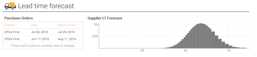
The code consists again of a title label using a Lokad icon, a table and a histogram.
show label "Lead time forecast" a14f14 FDAD31 {labelIcon: "truck"
                                               textColor: "#2e3133"}

PurchaseOrders.ObservedLTDays = PurchaseOrders.DeliveryDate - PurchaseOrders.Date + 1
PurchaseOrders.ObservedLT = concat(PurchaseOrders.ObservedLTDays + 1, " days")
PurchaseOrders.ObservedLT = if PurchaseOrders.DeliveryDate == date(2001, 01, 01) then
      "In Transit"
    else
      PurchaseOrders.ObservedLT

show table "Purchase Orders" a15b16 000000 slices:Slice {tileColor: #FDAD31} with
  PurchaseOrders.Supplier as "Supplier"
  PurchaseOrders.Date as "Date"
  PurchaseOrders.DeliveryDate as "Delivery Date"
  PurchaseOrders.ObservedLT as "Observed LT"
  PurchaseOrders.Quantity as "Quantity"
  PurchaseOrders.ConvNetAmount as "Net Amount" {unit:"$"}
  order by PurchaseOrders.Date desc

show scalar "Supplier LT Forecast" c15f16 {tileColor: #7c7c7c} slices: Items.Slice with
  Forecast.LeadTime
As last element, demand and fill rate distribution are depicted, using again a formatted mark down as quick explanation together with a reference to Lokad’s knowledge base.
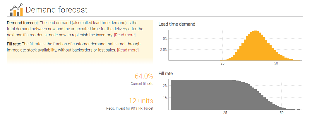
show markdown "" a18c19 {backgroundColor: #fff7dd; textAlign: left} with """

  __Demand forecast: __ The lead demand (also called lead time demand) is the
  total demand between now and the anticipated time for the delivery after
  the next one if a reorder is made now to replenish the inventory.
  [[Read more]](https://www.lokad.com/lead-demand-definition)

  __Fill rate: __ The fill rate is the fraction of customer demand that is met
  through immediate stock availability, without backorders or lost sales.
  [[Read more]](https://www.lokad.com/fill-rate-definition)

  """
Items.FillRate = fillrate(Items.Demand)

show label "Demand forecast" a17f17 FDAD31 {labelIcon: histogram
                                            textColor: #2e3133}

show scalar "Lead time demand" d18f19  slices: Items.Slice {tileColor: #fcaf20} with
  Items.Demand

{numbers: percent; precision: 1}
show scalar "Current fill rate" a20c20 fcaf20 slices: Items.Slice with
  int(Items.FillRate, 0, Items.StockOnHand + max(0, Items.StockOnOrder - Items.BackOrder))

{unit:" units"}
show scalar "Reco. Invest for 90% FR Target" a21c21 fcaf20 slices: Items.Slice with
  max(0, quantile(Items.FillRate, 0.90) - (Items.StockOnHand + Items.StockOnOrder))

show scalar "Fill rate" d20f21 7c7c7c slices: Items.Slice with fillrate(Items.Demand)