chart
chart, tile type
The chart supports composing a series of internal tiles. Unlike the other
tiles, the chart tile can take data from multiple tables as input.
Syntax
show chart introduces nested blocks that define the axes and series.
Blocks are indented under the with. Only plotxy blocks require an
order by; other blocks can end with order by when needed.
table T = extend.range(5)
T.X = T.N
T.Y = 2 * T.N

show chart "Scatter" with
  scatter T.X
    T.Y
Axis blocks
The horizontal axis can be free (no explicit haxis) or constrained.
Constrained axes support number, date, week, month, text, and enum.
When an haxis block is present, it must be written either as haxis by expr
or as haxis into Table; there is no bare haxis block.
Both forms define the same constrained axis. The difference is where the axis
values come from: haxis by expr uses the distinct values observed in expr,
while haxis into Table uses the primary dimension of Table.
table Sales = with
  [| as Product, as Date, as Quantity |]
  [| "socks", month(2024, 12), 10 |]
  [| "socks", month(2024, 11), 3 |]
  [| "hats", month(2024, 12), 4 |]
  [| "hats", month(2024, 11), 11 |]

show chart "" with
  haxis by Sales.Product
  scatter Sales.Product
    Sales.Quantity
Use haxis into when the axis domain already exists as the primary dimension
of a table, such as a grouped table or a calendar table. The chart blocks are
then projected onto that axis in the usual way:
table Sales = with
  [| as Product, as Date, as Quantity |]
  [| "socks", month(2024, 12), 10 |]
  [| "socks", month(2024, 11), 3 |]
  [| "hats", month(2024, 12), 4 |]
  [| "hats", month(2024, 11), 11 |]

table Products = by Sales.Product
Products.Quantity = sum(Sales.Quantity)

show chart "" with
  haxis into Products
    order by Products.Quantity
  plot into Products
    Products.Quantity { seriesType: bar }
Axis blocks can also be sliced. When haxis uses slices:, each slice gets
its own projected horizontal axis, and any order by attached to the haxis
is applied independently inside each slice.
table Sales = with
  [| as Region, as Product, as Qty |]
  [| "North", "A", 5 |]
  [| "North", "B", 2 |]
  [| "South", "A", 1 |]
  [| "South", "B", 8 |]

table Slices[slice] = slice by Sales.Region title: Sales.Region

show chart "" with
  haxis by Sales.Product slices: slice
    order by [sum(Sales.Qty)]
  plot by Sales.Product slices: slice
    sum(Sales.Qty) { seriesType: bar }
Vertical axes are always numeric. Use laxis and raxis blocks to attach
StyleCode. If both are present, series can specify vaxis: "left" or
vaxis: "right".
Data blocks
The block types are:
scatter: point cloud, similar toshow scatter.plotxy: curve over explicit(X, Y)coordinates; requiresorder by.plot: curve over a constrainedhaxisusingplot byorplot into.
plot requires an haxis to be defined.
Illustration: linear regression
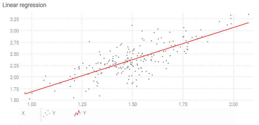
N = 200
table T = extend.range(N)

meanX = 1.5
sigmaX = 0.2
T.X = random.normal(meanX into T, sigmaX)

slope = 1.3
meanB = 0.4
sigmaB = 0.2
T.Y = slope * T.X + random.normal(meanB into T, sigmaB)

regressionA = (N * sum(T.X * T.Y) - sum(T.X) * sum(T.Y)) / (N * sum(T.X^2) - sum(T.X)^2)
regressionB = (sum(T.Y) - sum(T.X) * regressionA) / N

table LinReg = with
  [| as X, as Y |]
  [| min(T.X) into Scalar, (min(T.X) into Scalar) * regressionA + regressionB |]
  [| max(T.X) into Scalar, (max(T.X) into Scalar) * regressionA + regressionB |]

show chart "Linear regression" { precision: 5 ; axisMin: min } with
  scatter T.X
    T.Y { color: gray }
  plotxy LinReg.X
    LinReg.Y { color: red }
    order by LinReg.X
Illustration: moving average
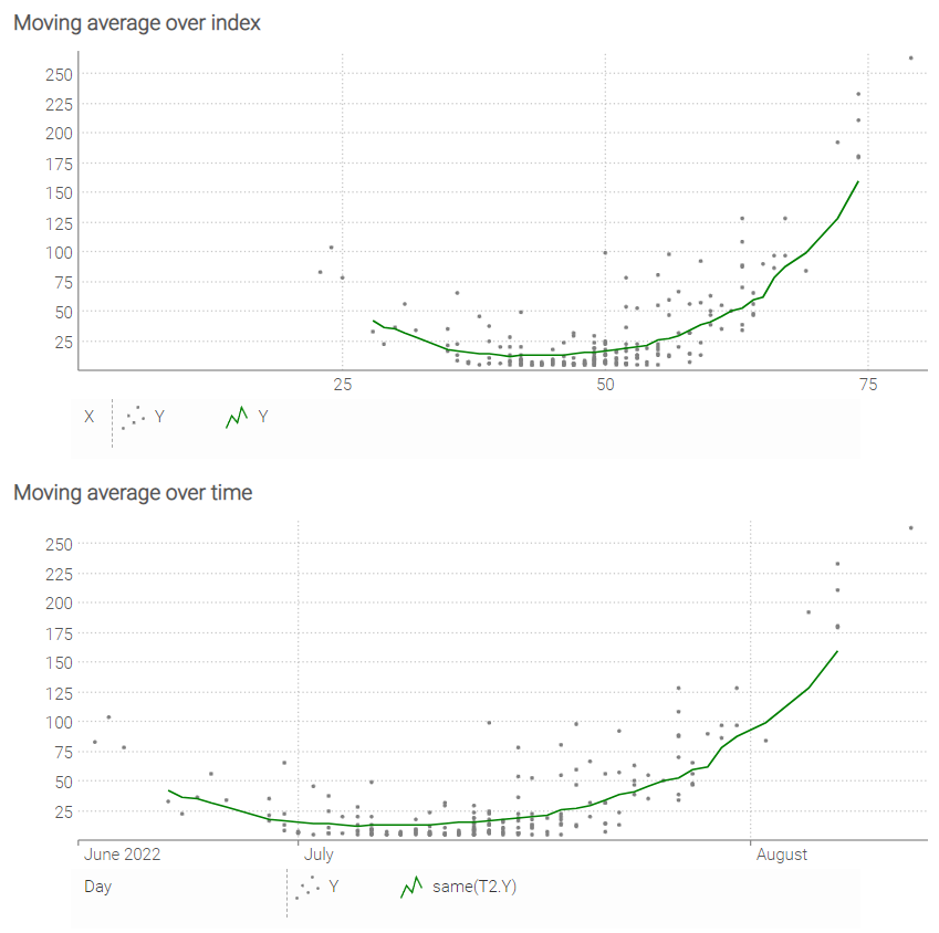
N = 200
table T = extend.range(N)

meanX = 50
sigmaX = 10
T.X = round(random.normal(meanX into T, sigmaX))

slope = 0.4
meanB = -18
sigmaB = 2
T.Y = 5 + (slope * T.X + random.normal(meanB into T, sigmaB)) ^ 2

table T2[X] = by T.X
T2.Y = avg(T.Y) over X = [-8..8]

minX = min(T.X)
maxX = max(T.X)

show chart "Moving average over index" with
  haxis by T2.X
  scatter T.X
    T.Y { color: gray }
  where T2.X > minX + 4 and T2.X < maxX - 4
    plot by T2.X
      T2.Y { color: green }

T.Day = date(2022,05,25) + T.X
T2.Day = date(2022,05,25) + T2.X

show chart "Moving average over time" with
  haxis by T2.Day
  scatter T.Day
    T.Y { color: gray }
  where T2.X > minX + 4 and T2.X < maxX - 4
    plot by T2.Day
      same(T2.Y) { color: green }
Illustration: populations
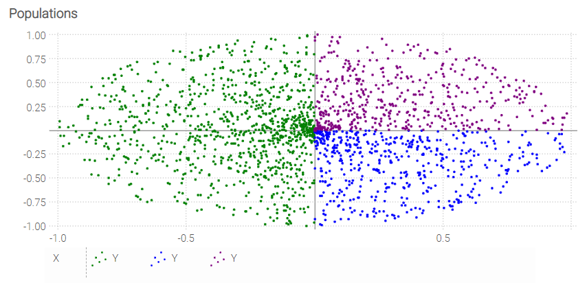
N = 2000
table T = extend.range(N)

const PI = 3.14159274101
T.Theta = random.uniform(0,2 * PI into T)
T.R = random.uniform(0 into T, 1)
T.X = T.R * cos(T.Theta)
T.Y = T.R * sin(T.Theta)

show chart "Populations" with
  where T.X < 0
    scatter T.X
      T.Y { color: green }
  where T.X >= 0
    where T.Y < 0
      scatter T.X
        T.Y { color: blue }
    where T.Y >= 0
      scatter T.X
        T.Y { color: purple }
StyleCode
For generic StyleCode rules, see stylecode.
In show chart, StyleCode may be attached to the chart tile itself, to blocks,
to series, and to the horizontal and vertical axes.