Styling dashboards
Envision includes a dedicated sub-language, called StyleCode, that allows a refined control over the dashboards style. It borrows strongly from CSS and its extensions, LESS and SCSS. Indeed, as in CSS, elements’ appearances are controlled within StyleCode’s snippets introduced via curly brackets and using semicolons to delimit attributes (e.g., {textColor: tomato; unit: "€}), and sub-elements inherit their parent elements’ properties, unless these are expressly redefined.
- StyleCode integration
- Recommended StyleCode formatting
- Formatting labels
- Formatting display of scalars
- Formatting tables
- Formatting line charts
- Formatting plots
- Displaying scatter plots
- Placing tiles
- Dynamic styling
StyleCode integration
StyleCode integration within Envision is straightforward: StyleCode snippets can be set up in StyleCode as a list of options enclosed in curly brackets or can be equivalently placed in the line before the show statement, in the same line as the show statement or spread over several lines, as illustrated in the following examples:
// Three equivalent syntaxes

{ textColor: tomato ; unit: "€" }
show table "Orders" with Id, Orders.NetAmount

show table "Orders" { textColor: tomato ; unit: "€" } with Id, Orders.NetAmount

show table "Orders" {
  textColor: tomato
  unit: "€"
} with Id, Orders.NetAmount
In the following, we review the potentialities of StyleCode, showing how every detail of a tile can be tuned in practice. A full list of target elements and their properties is provided in our StyleCode reference section. Furthermore, there is a dedicated sections on how to beautify dashboards.
Our goal in this section is to style main elements in a dashboard to reach the following layout.
In the following subsections we will explain each element.
Recommended StyleCode formatting
StyleCode consists of property-value assignments, such as textColor: tomato (assign the value tomato to the property textColor). Envision lets you place white-space anywhere in that statement, as well as surround the value with quotes. This allows for bits of fantasy in your code:
{    textColor   :"tomato";unit:    "€"    } // unusual spacing (not recommended)
{ textColor: "tomato"; unit: "€" }           // recommended formatting
For clarity and consistency, we recommend to:
- Include a single space after
{, before}and around{ - Include no space before
:, but at least one space after it - Surround arbitrary text (such as labels or units) with quotes:
unit: "pcs"instead ofunit: pcs - Leave numbers, keywords and colors without quotes:
color: #BBCC33,precision: 3,textAlign: center.
Formatting labels
Labels are used on Dashboards as title and structuring elements for dashboards. These can easily be formatted using StyleCode.
show label "Sales and supplier analysis" a1d1 {
  textAlign: center
  backgroundColor: "#f7f8f9"
  tileColor: "#5f5f5f"
}
This code centers the text of the label, defines the background color of the tile to #f7f8f9 and the accent color (in this case, the font color) to #5f5f5f. The result is the following:
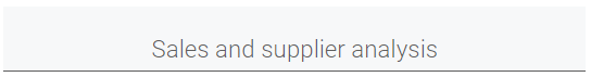
Formatting display of scalars
Here we want to format a number in the following way:
When formatting scalars, that is tables that consist of one column and one row, the StyleCode snippet immediately succeeds the title.
read "/clean/Lokad_Items.csv" as Items[Id] with
  Id : text
  BuyPrice : number
  BuyCurrency : text
  StockOnHand : number

Items.BuyPriceEUR = forex(Items.BuyPrice, Items.BuyCurrency, "USD", today() - 2)
show scalar "Stock Available" e1 {
  textAlign: center
  unit: "$"
  numbers: thousands
  backgroundColor: "#f87551"
  tileColor: "#404040"
} with sum(Items.StockAvailable * Items.BuyPriceEUR) as "Stock Available (Vol)"
Numbers: "thousands" ensures that instead of the precise value, $ 54 820.4 , is displayed in a rounded format, $ 54.82k. Since we want the value to be expressed in USD with the $ sign in front of the number, we declare this with unit:"\$"; unitPosition:"left".
In fact, unitPosition:"left"` is in our case redundant, since Envision automatically positions the unit sign on the left for €, $ and £.
Formatting tables
StyleCode offers a variety of possibilities to format tables: Notably, one has options to format the header of the tile and the positioning as well as individual column properties.
In the following code snippet we want to display the relationship of articles with their suppliers and related buying information.
read "/clean/Lokad_Items.csv" as Items[Id] with
  Id : text
  Name : text
  Category : text
  Brand : text
  Supplier : text
  BuyPrice : number
  BuyCurrency : text
  BuyPriceEUR : number
  StockOnHand : number
  LeadTime : ranvar

Items.InScope = Items.Category == "Office Supplies"
Items.IsTargetBrand = Items.Brand == "Avery" or Items.Brand == "Xerox"
Items.StatusIcon = if Items.InScope then "✔️" else "❌"

show table "Products and their suppliers" a3g5 {
  // StyleCode in this line defines the header of the tile and its positioning
  tileColor: "#5f5f5f"
  backgroundColor: "#a7a7a7"
} with

  // Stylecode next to column names define column designs and properties
  Items.StatusIcon as "In Scope?" { textAlign: right }
  Items.Name { cellBackground: "#f8f8f8" }
  Items.Category { cellBackground: "#f8f8f8" }
  Items.Brand { cellBackground: "#f8f8f8" }
  Items.Supplier {
    cellBackground: "#a7a7a7"
    textColor: "#f87551"
  }
  Items.BuyPriceEUR {
    unit: "€"
    cellBackground: "#a7a7a7"
    fractionSeparator:","
  }
  Items.LeadTime { unit: " days" ; cellBackground: "#a7a7a7"}
This results in the following tile:
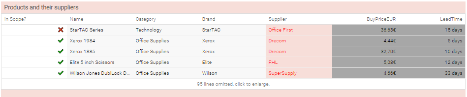
Using StyleCode we want to graphically link columns related to an article together, as well as the columns relating to the supplier and buying conditions by assigning them different column colors, namely \#f8f8f8 for the article related columns and \#a7a7a7 for the supplier related columns.
Apart from the cellBackground specifications, the same properties as for using scalars can be used. Here, we have e.g. placed the status icon aligned to the right with { textAlign: right }, so that it is directly next to the article name.
A useful property when working with different currencies or when encountering different number formats, is the option fractionSeparator: "," which allows one to switch the decimal point from . as in \$1.50 to , as in to 1,50€.
Units are not limited to currency signs: In this example we have expressed lead times in days by specifying unit: " days" in the last column.
For the status icon we have used the possibility in Envision to display HTML UTF8 symbols (see e.g. here for a list) which can be integrate by just copy and pasting them into the code.
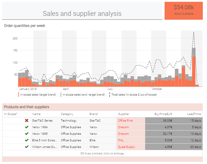
Formatting line charts
StyleCode permits to integrate both stacked as well as line type graphs for linecharts. In the below example,
we assume that our item table has a boolean flag InScope flagging those articles that are eligible for the Lokad optimization. Furthermore, there is a different flag IsTargetBrand flagging those eligible items that are belonging to a distinguished group of brands that we would like to highlight.
In the linechart diagram, we illustrate weekly sales of articles that are in scope and are part of the target brand category with orange bars and we stack the non-target sales that are in scope in grey on top. This allows us to express that the sum of these two is in fact the sum of all target and non-target sales of items that are in scope.
For reference, we include also a dashed line with the total amount of sales including also the sales of items that are not in scope. Using a dashed line instead of a solid line (which is the default setting) allows us to express that the quantity shown is only a reference.
read "/clean/Lokad_Items.csv" as Items[Id] with
  Id : text
  Category : text
  Brand : text
read "/clean/Lokad_Orders.csv" as Orders expect [Id, Date] with
  Id : text
  Date: date
  Quantity : number

Items.InScope = Items.Category == "Office Supplies"
Items.IsTargetBrand = Items.Brand == "Avery" or Items.Brand == "Xerox"

Week.SalesQ = sum(Orders.Quantity)
Week.SalesQInScope = sum(Orders.Quantity) if (InScope and not IsTargetBrand)
Week.SalesQInScopeTarget = sum(Orders.Quantity) if (InScope and IsTargetBrand)

show linechart "Order quantities per week" a3e6 with
  Week.SalesQInScope as "In scope sales (target brand)" {seriesType: stack; color: "#f87551"}
  Week.SalesQInScopeTarget as "In scope sales (excl. target brand)" {seriesType: stack;color: "#a7a7a7"}
  Week.SalesQ as "Total sales (in scope and out of scope)" {seriesType: line; seriesPattern: dashed; color: "#5f5f5f"}
The above code translates into the following example.
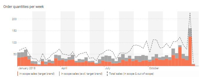
The two series types (line or stack) are expressed via seriesType: line and seriesType: stack, respectively. For lines, the options are
- solid, that is
seriesPattern: solid. This is the default value, so one does not need to specify it; - dotted, that is
seriesPattern: dotted; - dashed, that is
seriesPattern: dashed.
For stacked bar charts, the order of definition is important. If we were to change the order of our two stacked bar charts, the orange bars would appear on top of the grey ones.
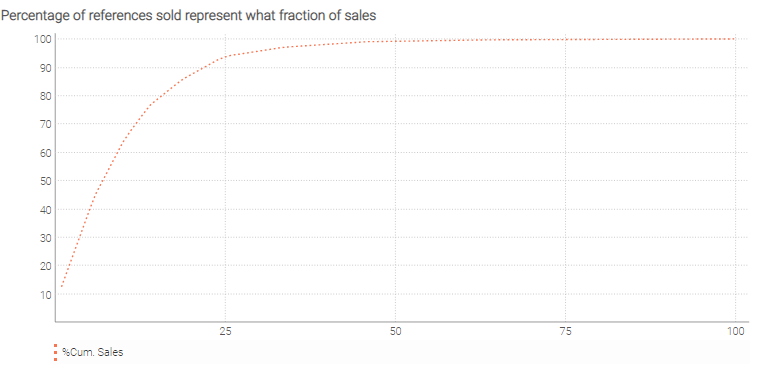
Formatting plots
The plot tile is intended to display a function f(x)=y. The same semantics that are applied to show linechart can be used to style the plots. To format the plots, several options are available:
- solid, that is
seriesPattern: solid, which is the default value; - dotted, that is
seriesPattern: dotted; - dashed, that is
seriesPattern: dashed.
The following example uses seriesPattern: dotted option when showing the plot to display what percentage of references sold during last year represent what fraction of sales, e.g., 1% of the items represent ~12% of total sales (quantities) and only 10% of best references stand for 64% of total sales.
read "/sample/Lokad_Items.tsv" as Items[Id] with
  Id : text
read "/sample/Lokad_Orders.tsv" as Orders expect [Id, Date] with
  Id : text
  Date : date
  "NetAmount" as OrderAmount : number

oend = max(Orders.Date)

refNb = distinct(Id)
where date >= oend - 365
  totalSalesAmount = sum(Orders.OrderAmount)
  Items.SalesAmount = sum(Orders.OrderAmount)
Items.SalesPercentage = round(Items.SalesAmount / totalSalesAmount * 100, 3)

Items.RefRank = rank() sort [Items.SalesAmount, Id]
Items.SalesPercentageCumsum = cumsum(Items.SalesPercentage) sort Items.RefRank
Items.ItemsPercentage = round(Items.RefRank / refNb * 100, 3)

show plot "Percentage of references sold represent what fraction of sales" b2f6 e28819 with
  Items.ItemsPercentage as "%Refs" {seriesPattern: dotted; color: "#f87551"}
  Items.SalesPercentageCumsum as "%Cum. Sales" {seriesPattern: dotted; color: "#f87551"}
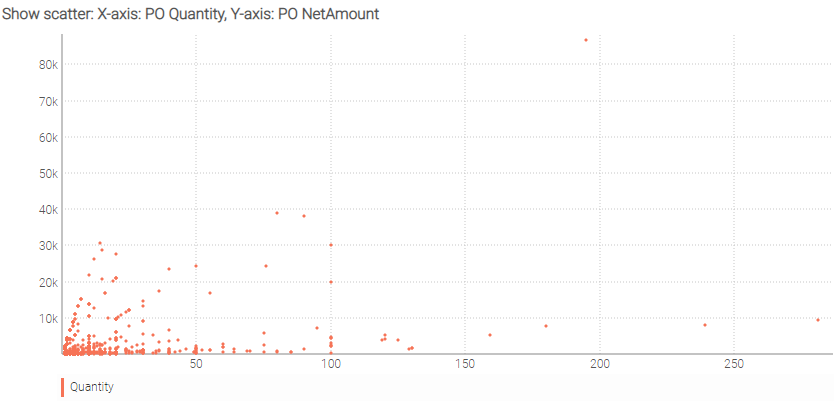
Displaying scatter plots
The scatter plot tile is a type of plot or mathematical diagram using Cartesian coordinates and is intended to display values for distinct numeric variables for a set of data. Scatter plots display dots. The position of each dot on the horizontal and vertical axis indicates values for an individual data point. Scatter plots facilitate the observation of the relationships between variables.
read "/sample/Lokad_Items.tsv" as Items[Id] with
  Id : text
read "/sample/Lokad_PurchaseOrders.tsv" as PO expect [Id, Date] with
  Id : text
  Date : date
  Quantity : number
  NetAmount : number

show scatter "Show scatter: X-axis: PO Quantity, Y-axis: PO NetAmount" b2f6 e28819 with
  PO.Quantity as "Quantity" {color: "#f87551"}
  PO.NetAmount as "NetAmount" {color: "#f87551"}
Placing tiles
The placement of a tile is chiefly determined by the property tilePlacement, which can take the values fixed and bottom (the default).
If fixed is chosen, the position and dimensions of the tile can all be directly specified by the user. The position of a tile is defined by setting up the x and y coordinates of the top-left corner of the tile with respect to the dashboard surface (the top-left corner of the dashboard has coordinates (0,0)).
This is accessible through the properties tileX and tileY (default value is $0$). The tile’s dimensions can as well be determined, using tileW for the width and tileH for the height, both having the value $1$ as default.
Otherwise, by default (bottom) a tile is placed on the first empty row of the dashboard (below all user-positioned tiles), starting from the left. If several tiles have to be positioned by default, they are placed from left to right up to the dashboard width, in the order in which they appear in the script, with dimensions $1 \times 1$. The bottom placement mode is applied also in the case where two fixed tiles overlap: the tile appearing second in the script is switched to tilePlacement: bottom.
read "/clean/Lokad_Items.csv" as Items[Id] with
  Id : text
  BuyPrice : number
  SellPrice : number
read "/clean/Lokad_Orders.csv" as Orders expect [Id, Date] with
  Id : text
  Date: date
  NetAmount : number

{ tilePlacement: fixed ; tileX: 2 ; tileY: 3 ; tileW: 4 ; tileH: 5 }
show table "Orders" with Id, Orders.NetAmount
Dynamic styling
So far, the StyleCode has been static, the values of the style attributes being hard-coded within the Envision script.
However, StyleCode offers the possibility to achieve data-driven styling, where styles are injected from the data into
your dashboard. This is done using the #(expression) syntax where expression must be a scalar value.
Here is an example of using a currency variable to display the currency:
currency1 = same(Currency.Currency)
currency2 = "EUR"

show table "Currencies"  with
  Id
  Items.BuyPrice { unit: #(currency1) }
  Items.SellPrice { unit: #(currency2) }
As a second example, let’s see how #(expression) allows a user to conditionally color a tile:
oKColorBG = if 1 == 0 then "69af5d" else "a8080d"

show scalar "Color your background" a15 {backgroundColor: #(oKColorBG)} with
  "It works"
At this point of time, #(expression) cannot be used with a vector. As a consequence, it is not yet possible to programmatically control the color of every cell in a table tile (i.e. conditional formatting in Excel).